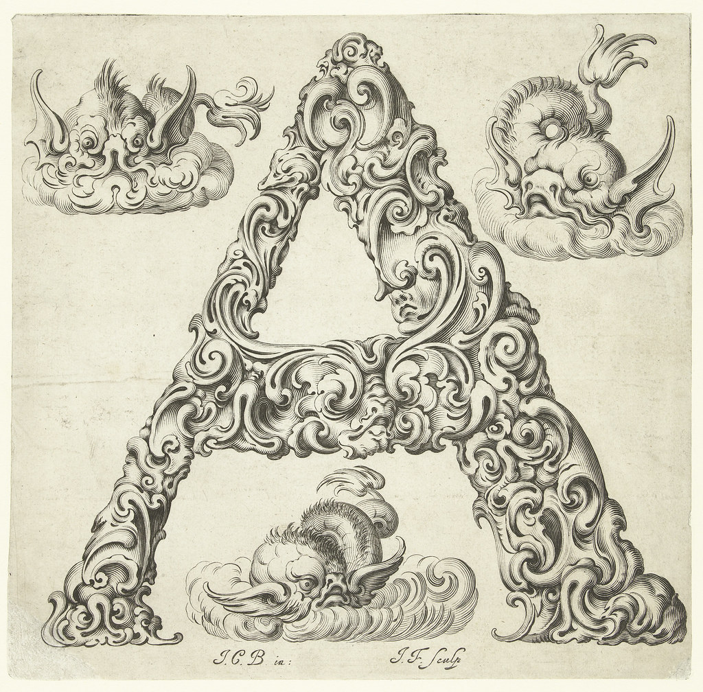
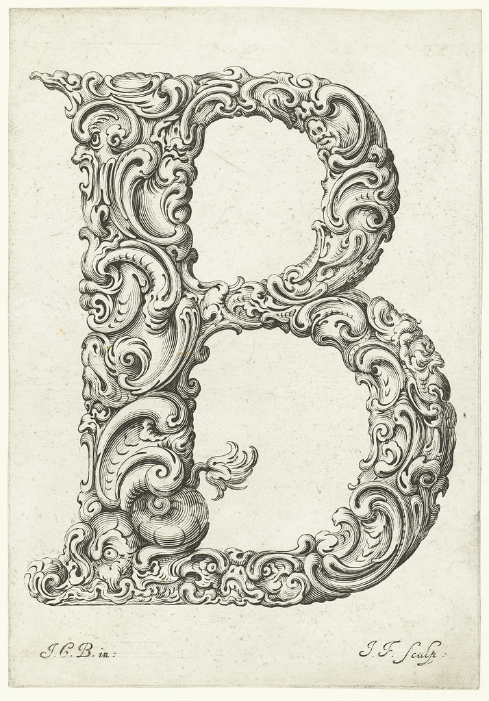
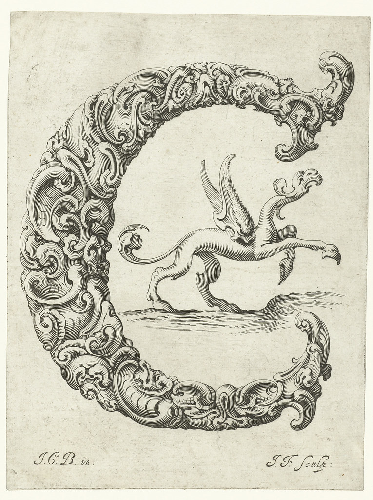
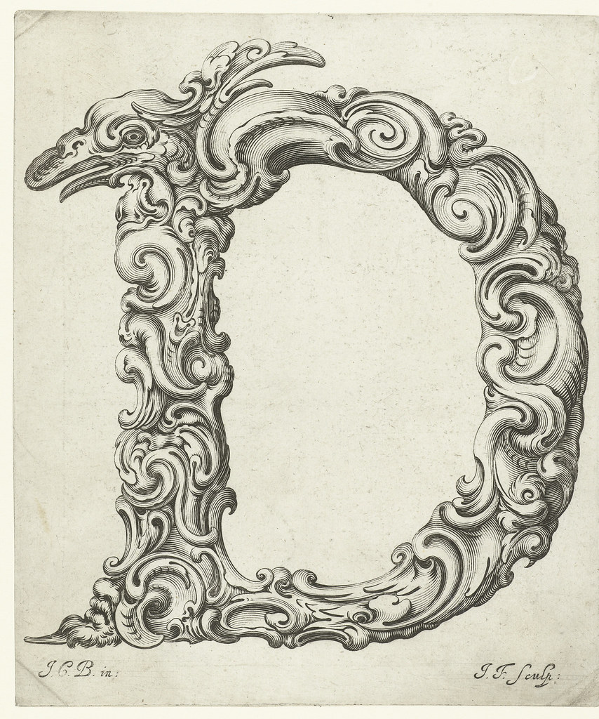
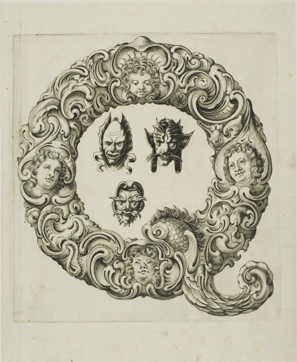
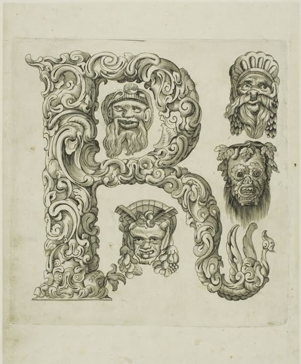
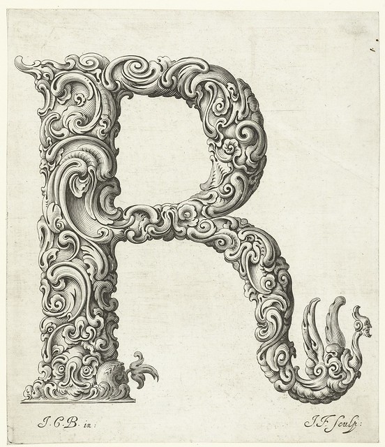
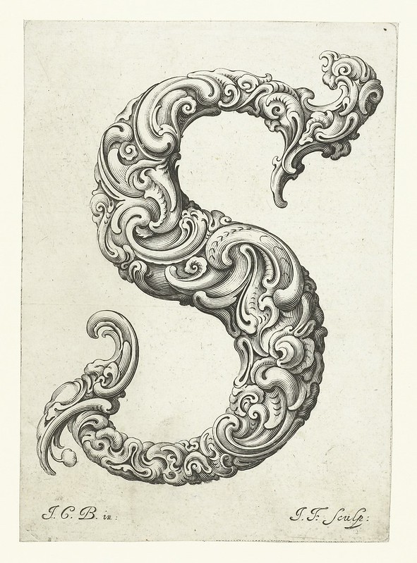
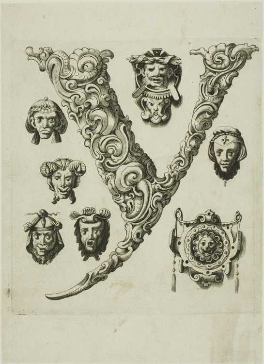
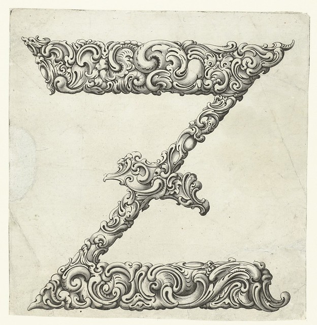
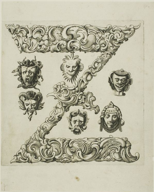
When we think of typography today, the conversation is often about sleek minimalism, sans-serifs, or the digital tools that shape our visual landscape. But if we turn the clock back to the 1600s and 1700s, typography was an entirely different art form — one woven deeply into the worlds of engraving, metalwork, and ornamental design. During this era, type wasn’t just a means of communication; it was an elaborate spectacle, a demonstration of artistic prowess and technical mastery. Letterforms were shaped by the same hands that created intricate jewelry, armor, and ceremonial objects. The ornamental typography of the time reflected the spirit of Baroque Europe — rich, extravagant, and delightfully excessive — where function met fantasy at every curve and contour.
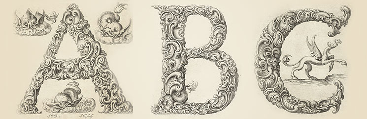
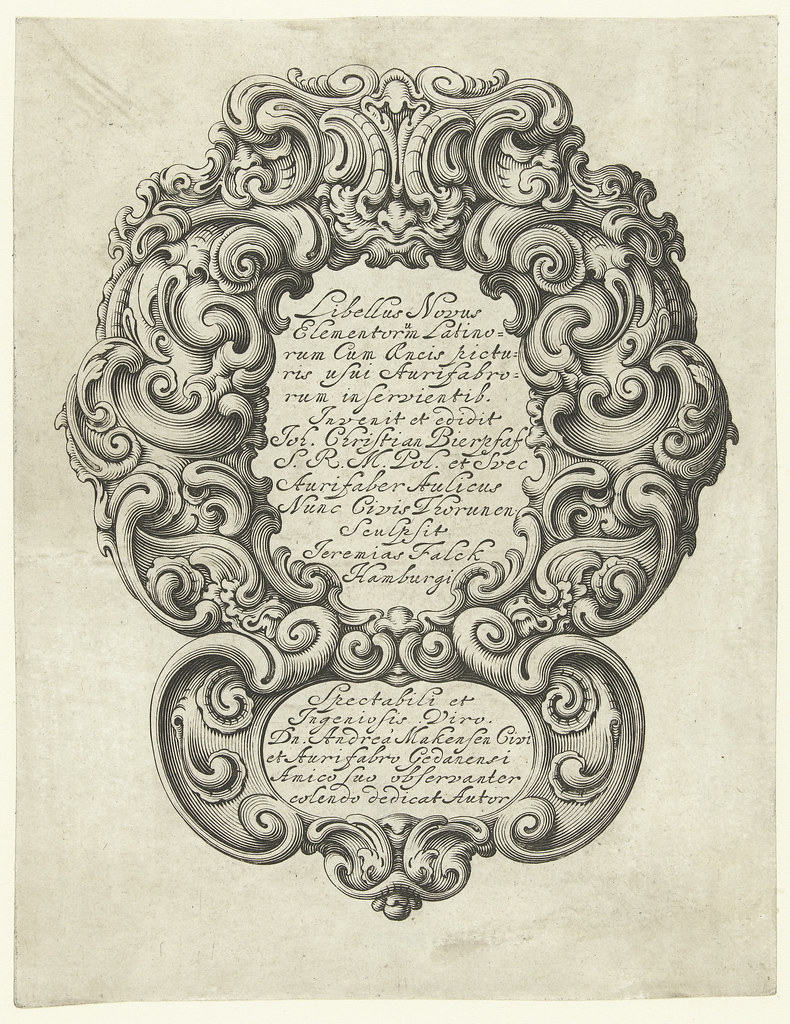
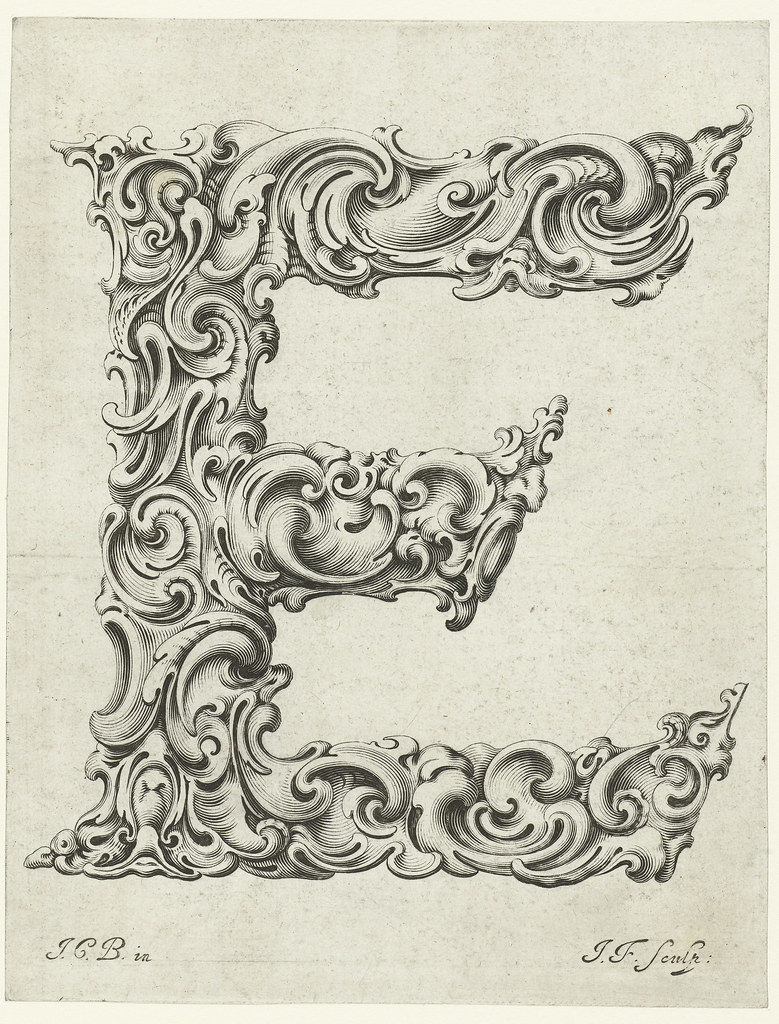
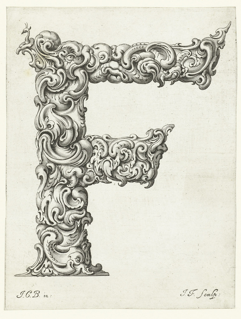
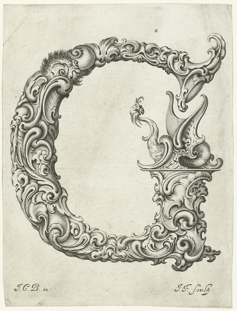
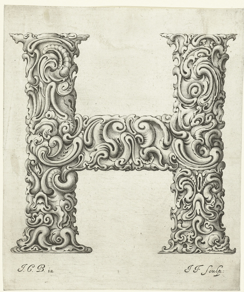
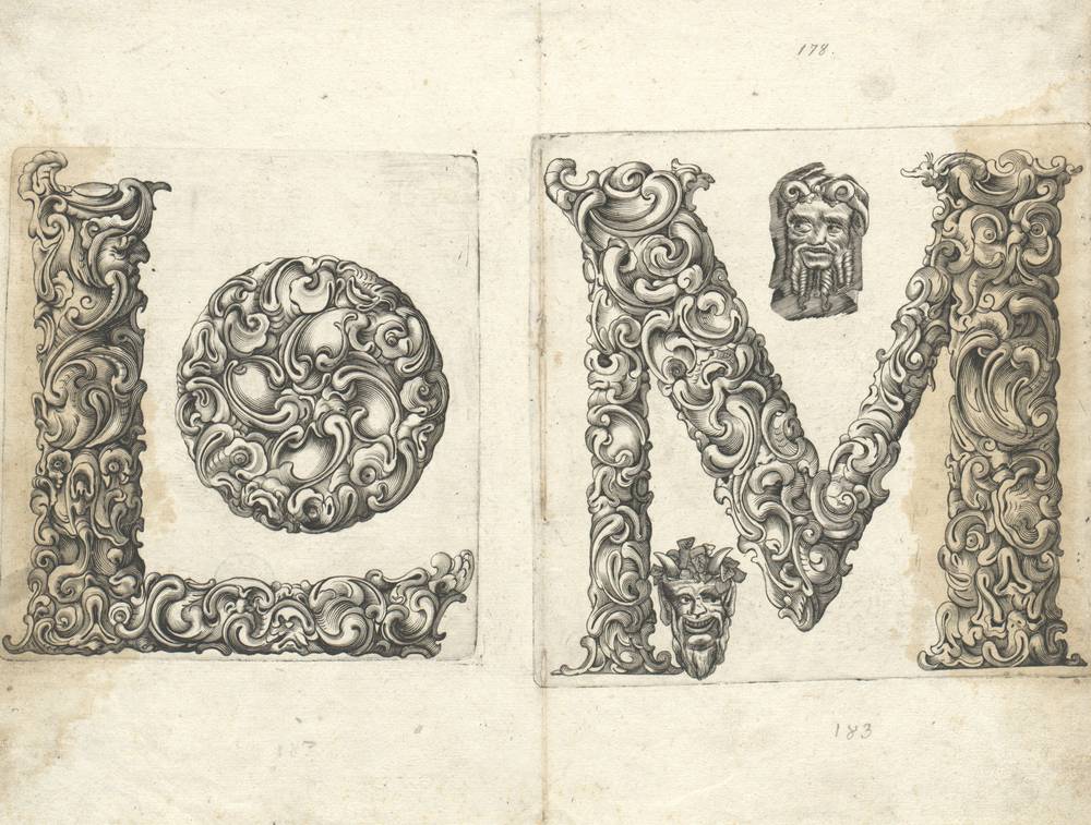
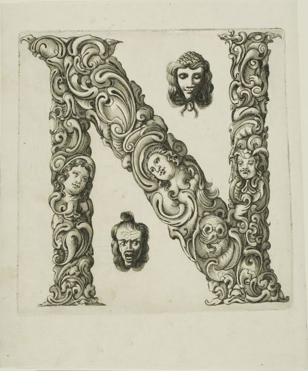
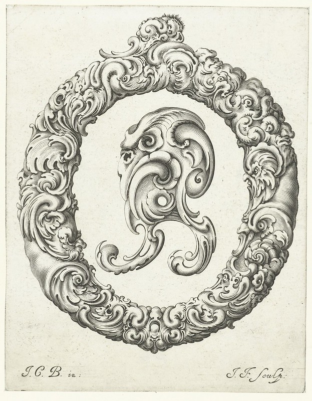
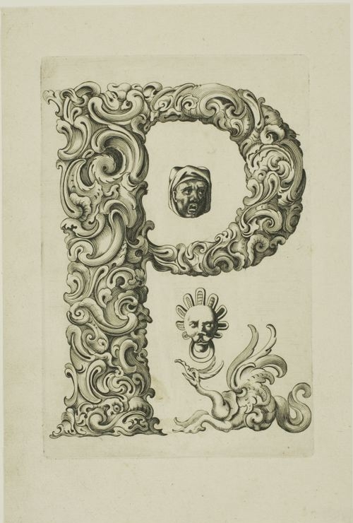
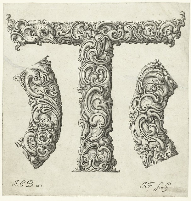
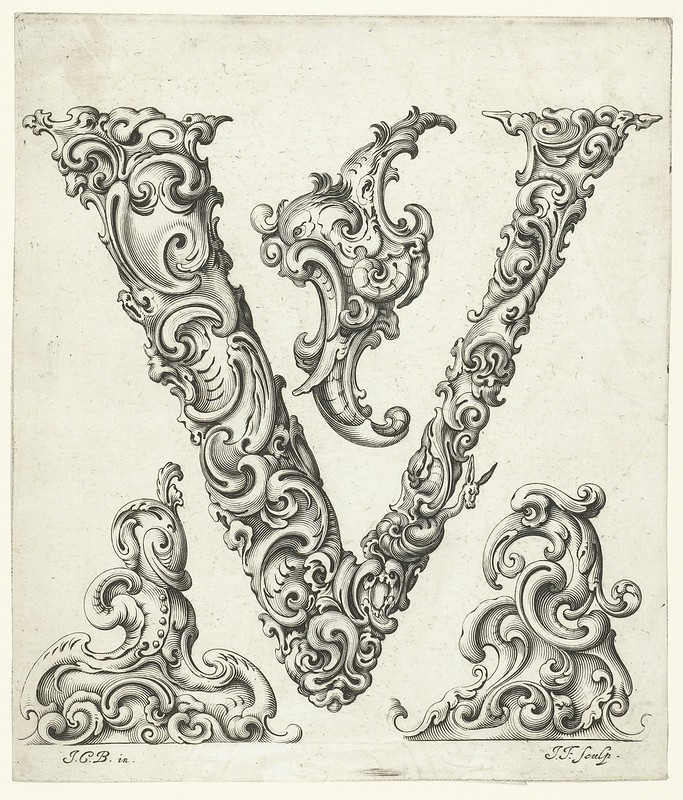
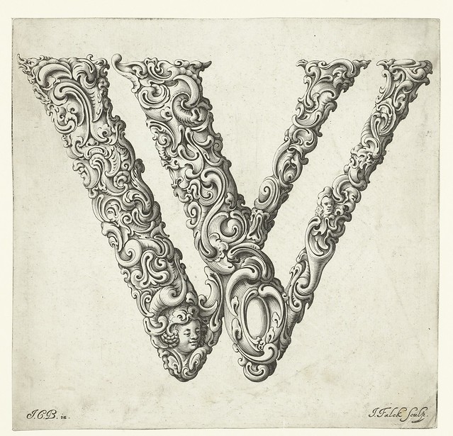
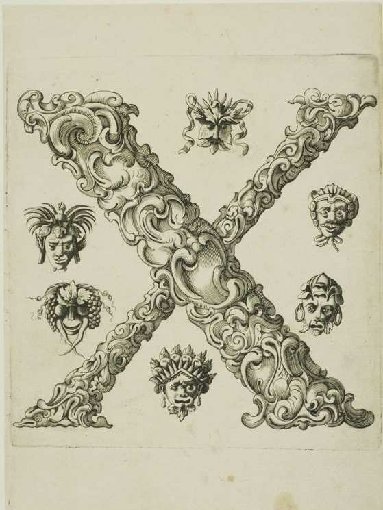
A brilliant example of this artistic convergence is the collection known as Libellus Novus Elementorum Latinorum, a series of engraved alphabet plates born from the collaboration between two Polish artisans: goldsmith Jan Christian Bierpfaff (1600 – ca. 1690) and master engraver Jeremias Falck (1610–1677).
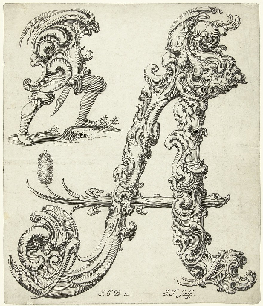
Bierpfaff was not only a skilled craftsman in metal, but a true student of European design trends. During his early years, he apprenticed with the Mackensen family in Cracow, a workshop responsible for introducing the Dutch auricular style to Polish goldsmithing. The auricular style, whose name refers to its “ear-like” organic forms, brought a fluid, almost otherworldly quality to decorative objects — and this influence is unmistakably present in Bierpfaff’s letter designs.
The alphabets in Libellus Novus Elementorum Latinorum feel alive. The letters twist and morph, balancing on the edge between the botanical and the bizarre. At first glance, you see the refined echoes of Baroque symmetry, but soon the grotesque emerges — vines and tendrils snake around serifs, limbs twist into ligatures, and letters seem to breathe and move under your gaze.
This collaboration between Bierpfaff and Falck created more than ornamental typography. It produced an elegant paradox: letterforms that are both legible and surreal, disciplined and wildly imaginative. Their work remains one of the most charming and eccentric relics from an age where lettering was never simply read — it was experienced.
Comments are closed.
 |
 |
 |
 |
...sketching on an old project, exploring the possibilities for a bit. #Lettering #LetteringIllustration… twitter.com/i/web/status/1…


Copyright © 2010 - 2025 TheCreativeBalloon.com | all content is a property of TheCreativeBalloon.com | designed by Eugen Golumbeanu - All rights reserved
Recent Comments